royal farms

overview
Royal Farms is a chain of service stations in the mid-Atlantic region that serves freshly prepared fried chicken, sandwiches, sides, and other food items. To get food, customers must place their orders using a self-service kiosk, which the company refers to internally as the CSS. For this project, the company enlisted our help to redesign the CSS, seeing as the old design was difficult for many customers to use and was causing some confusion during the ordering process.
-
Royal Farms, in partnership with UMD’s iConsultancy Program
-
September 2021 – December 2021
-
4 graduate students from the HCI Program at UMD
-
UX Research, UX Design, Usability Testing, Visual Design, Interaction Design, Prototyping, Team Communicator (Sprint 2)
-
Figma, Miro, Slack, Google Workspace

Main Menu (Original Kiosk)
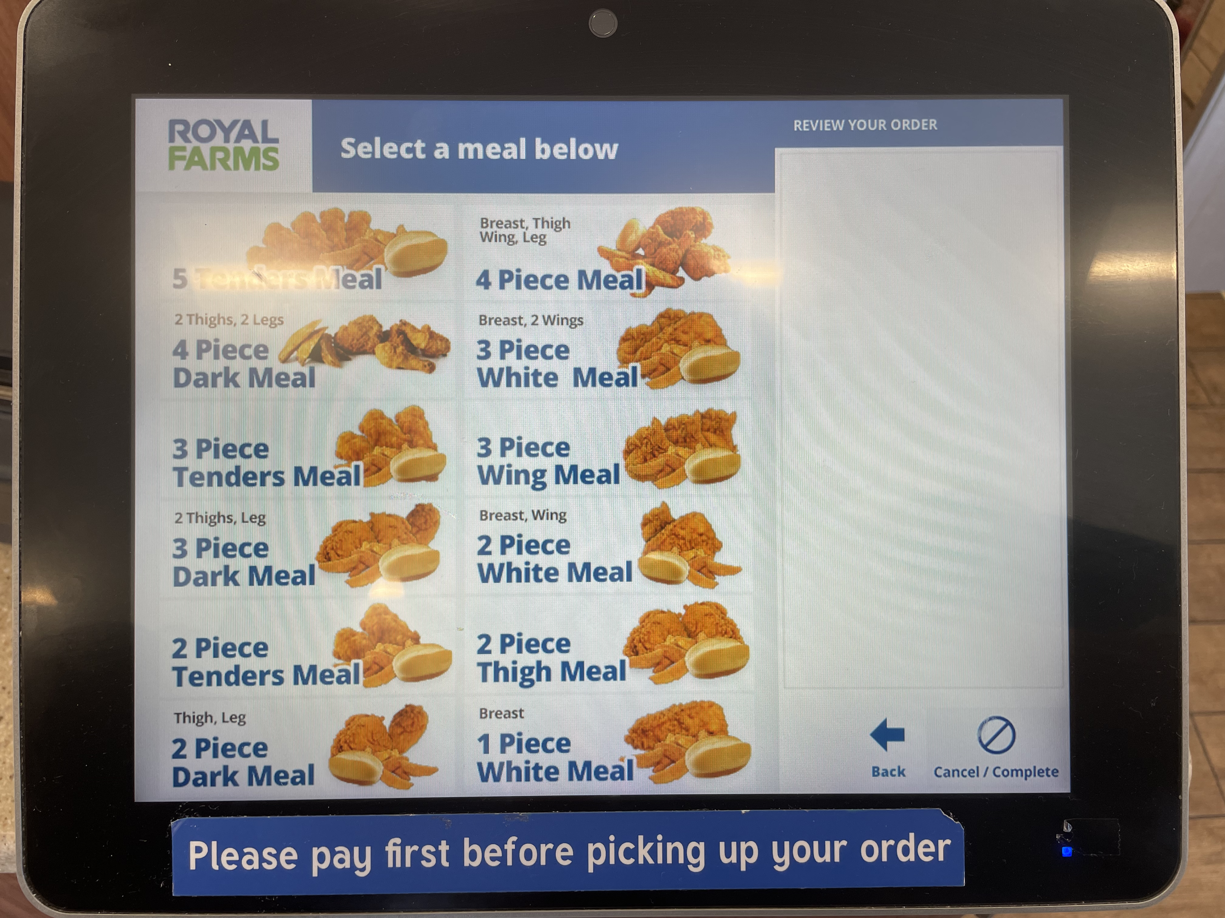
Chicken Menu (Original Kiosk)
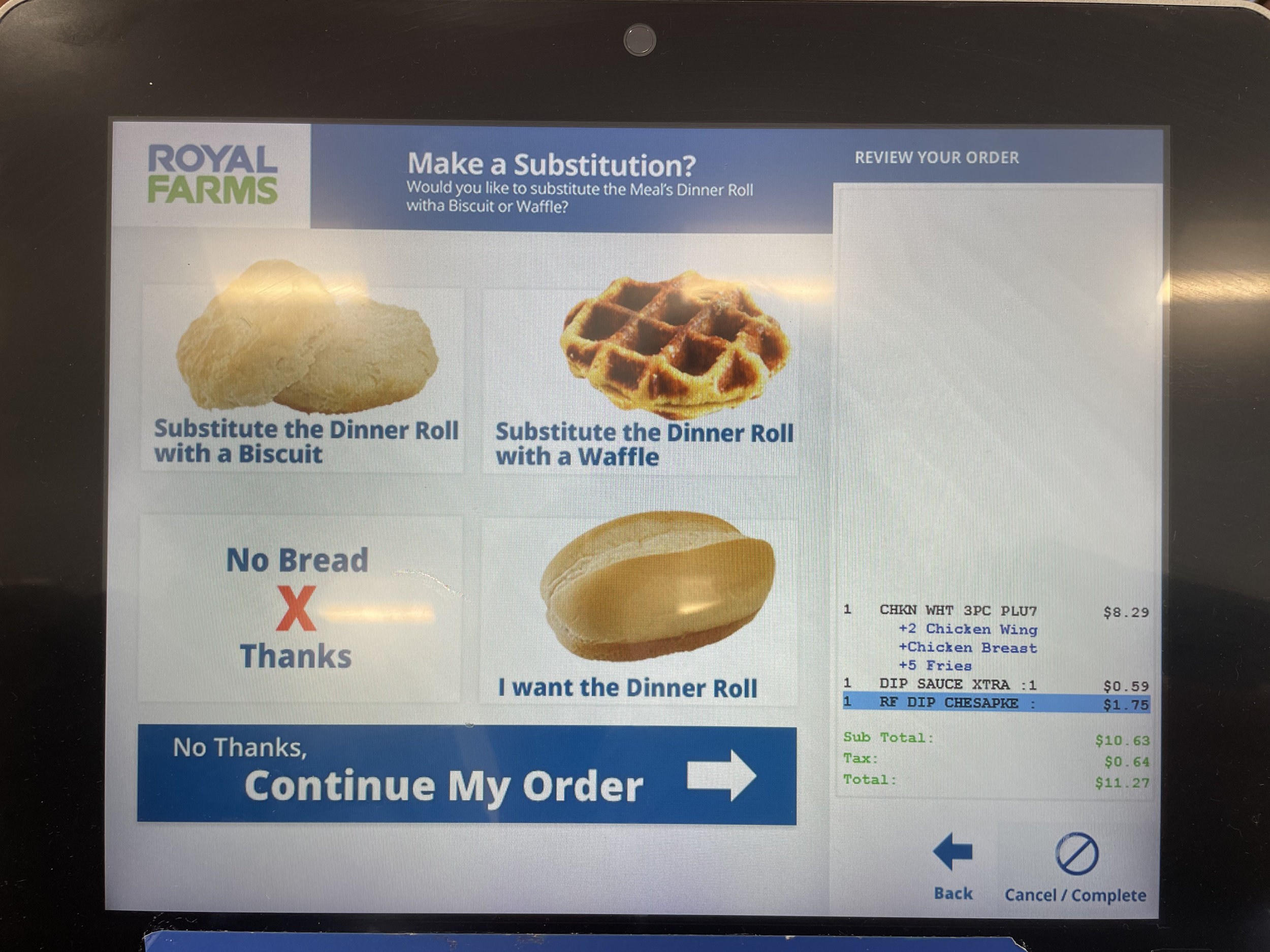
Choose Bread (Original Kiosk)

Upsell Screen (Original Kiosk)
design process
Over the course of this project, we used Google’s Design Sprint Methodology to guide our design process. We completed two, four-week-long Design Sprints over the course of the semester. As the project progressed, we adapted and modified the Sprint process when necessary to best serve the needs of the project and of the client.
-
Set the Sprint goal, define and map the problem
-
Research competing solutions, sketch potential design ideas
-
Prototype design solution
-
Conduct user testing, analyze findings

sprint 1
week 1
During this week, we carried out expert interviews with several Royal Farms employees and the development team, set the Sprint goal, came up with How Might We Questions, and defined and mapped the problem.
sprint 1 goal
To create a more profitable CSS with a better customer experience.
hmw questions
-
How might we redesign the CSS to feel more approachable and less intimidating?
-
How might we reorganize the information architecture of the CSS to more closely reflect customer mental models?
-
How might we create a smoother transition between paying for and picking up an order?
week 2
This week we conducted a literature review to learn about the best practices for kiosk design. We also gave lightning demos on the kiosks of competing service stations and fast food restaurants to provide inspiration for our designs. We then sketched potential design ideas and decided on which ideas to move forward with. Lastly, we created a storyboard of the customer journey using our favorite ideas.
literature review
During our literature review, we discovered many helpful tips for designing user-friendly kiosks. Here are some of the tips that we incorporated into our design:
All written language should be easy to understand at any reading level.
Limit the need for consumers to use any kind of search function.
Request information sequentially, not simultaneously.
Reveal all the required steps from the start.
Make it easy-to-decipher which elements are tappable.
Offer legible text and graphics.
sketching
Here is an example of one of the design solutions that I sketched during this week:

week 3
This week we used Figma to prototype our design, and we created a user test plan.
week 4
This week we tested our prototype with 5 different users. These users were given to us by Royal Farms, and they varied significantly in age, occupation, and familiarity with technology. Furthermore, they were all previous Royal Farms customers that had used the CSS before.
Overall, users found our design to be much easier to use than the old design. However, we did notice a few common issues with our design that could be improved upon:
Some users had trouble customizing their order (choosing sauces, sides, bread, quantity, etc.).
Some customers weren’t sure where to tap to begin their order. There wasn’t a clear call-to-action button.
The design of the upsell screen did not look different enough from the other screens to distinguish those items as being “extra.”
selected designs from sprint 1
-
![]()
Screen Saver
This is the Sprint 1 iteration of our kiosk screen saver. We included the steps at the top so that customers would know what to do between placing and picking up their order. However, because these steps look like buttons, we found that some users were unsure about where to tap to begin ordering.
-
![]()
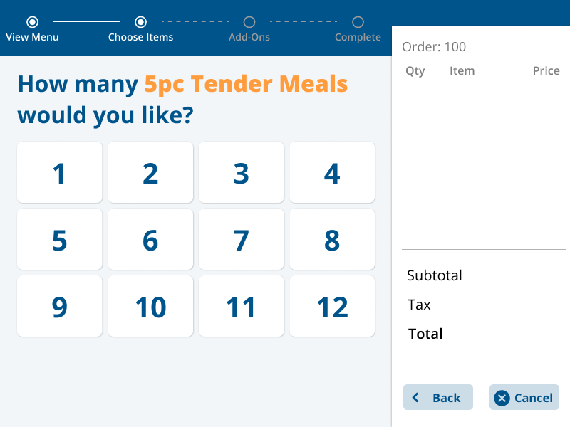
Quantity Choice
We wanted to make it easier for customers to order multiples of the same item, but during our user testing we found that this was a confusing question for some customers. We also found that most users do not typically order more than one of the same item.
-
![]()
Sauce Choice
Our users liked the design of this screen, because they felt like it was a simple design and that it met their expectations for what a sauce choice screen should look like. They also appreciated the inclusion of the breadcrumb navigation at the top of the screen, because it let them know where they were in the ordering process. However, one thing that several customers pointed out was that this design did not let them know which sauces cost extra, and it also did not allow them to choose two of the same sauce.
-
![]()
Upsell Screen
During our user testing, we found that this design for the upsell screen did not look different enough from our other designs to fully distinguish these items as being “extra.”


sprint 2
week 1
This week we set our goals for Sprint 2 and came up with our How Might We Questions. Because we discovered some flaws in our kiosk design during our Sprint 1 user testing, we decided that our primary goal for Sprint 2 would be to fix and refine our design from Sprint 1.
We also met with the development team in between Sprint 1 and 2 and discovered that some of our design was not technically feasible, so another one of our goals for this Sprint was to alter our design so that it would be technically feasible for the development team.
sprint 2 goal
To (1) make adjustment to our prototype based on software limitations and Sprint 1 user testing, and (2) reduce design gaps, add missing details, and create more functioning flows.
hmw questions
-
How might we make the upsell screens more distinct from other screens?
-
How might we let customers know how to begin their order?
-
How might we indicate that certain sides and sauces cost extra?
week 2
This week we sketched new design ideas and decided which changes to make to our Sprint 1 prototype. We also made updates to our storyboard to reflect these changes.
sketching
Here is an example of one of the design solutions that I sketched during this week:

week 3
During this week, we redesigned our prototype from Sprint 1 and updated our user test plan.
week 4
When we tested our Sprint 2 prototype with 5 new Royal-Farms-provided users, we received very positive feedback. We also received positive feedback from both our client and the development team. Overall, users were very happy with our product and stated that it was much easier to use than the current CSS design.
final designs
-
![]()
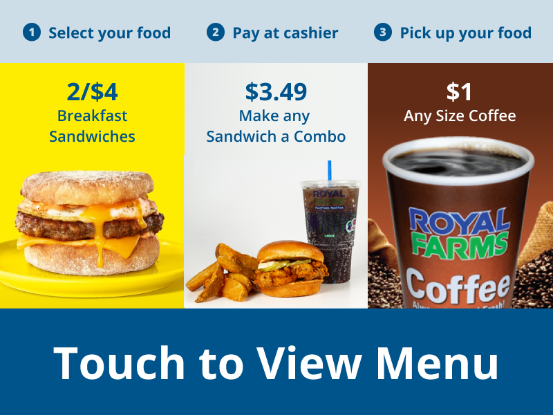
Screen Saver
For this screen, we changed the design of the steps at the top to make them look less like buttons. We also added the large text at the bottom of the screen to increase the clarity of the instructions and to ensure that customers actually notice the call-to-action.
-
![]()
Main Menu
For the menu screens, we recategorized the food items to better match the physical menu that Royal Farms already had. Our goal was to reduce confusion and redundancy and better match customer mental models.
-
![]()
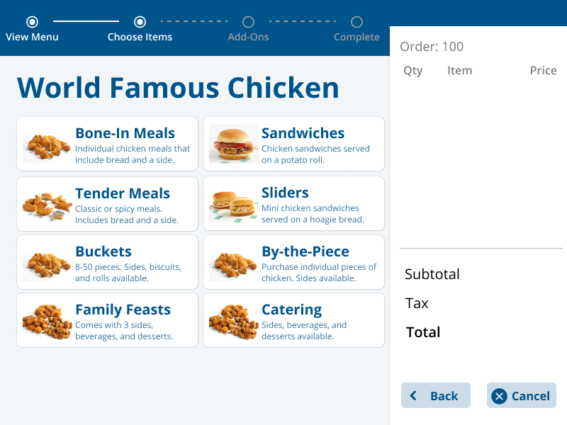
World Famous Chicken
For the menu screens, we recategorized the food items to better match the physical menu that Royal Farms already had. Our goal was to reduce confusion and redundancy and better match customer mental models.
-
![]()
Chicken Tender Meal
For the menu screens, we recategorized the food items to better match the physical menu that Royal Farms already had. Our goal was to reduce confusion and redundancy and better match customer mental models.
-
![]()
Regular or Spicy
We chose to place each customization step on its own screen in order to request information sequentially rather than all at once, as was recommended by the literature. This helps to reduce the cognitive load that is placed on the user.
-
![]()
Choose Bread
We chose to place each customization step on its own screen in order to request information sequentially rather than all at once, as was recommended by the literature. This helps to reduce the cognitive load that is placed on the user.
-
![]()
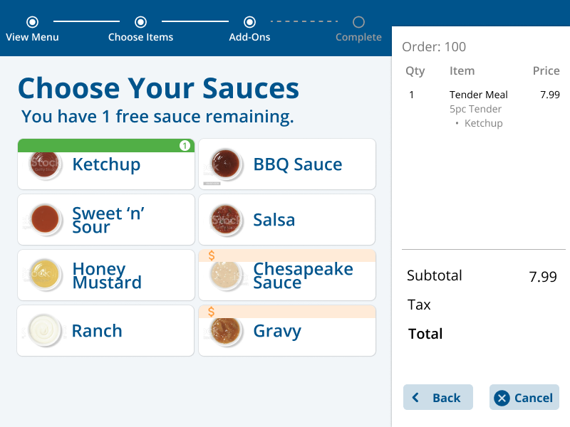
Choose Sauces
For the sauces, we added orange bars to the top of some of the cards to indicate that those sauces cost extra. We also added a number at the top right-hand corner of each selected sauce to show the quantity that has been added to the order.
-
![]()
Sauce Choice 1
For the sauces, we added orange bars to the top of some of the cards to indicate that those sauces cost extra. We also added a number at the top right-hand corner of each selected sauce to show the quantity that has been added to the order.
-
![]()
Sauce Choice 2
For the sauces, we added orange bars to the top of some of the cards to indicate that those sauces cost extra. We also added a number at the top right-hand corner of each selected sauce to show the quantity that has been added to the order.
-
![]()
Choose Side
We chose to place each customization step on its own screen in order to request information sequentially rather than all at once, as was recommended by the literature. This helps to reduce the cognitive load that is placed on the user.
-
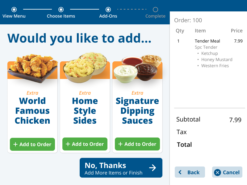
![]()
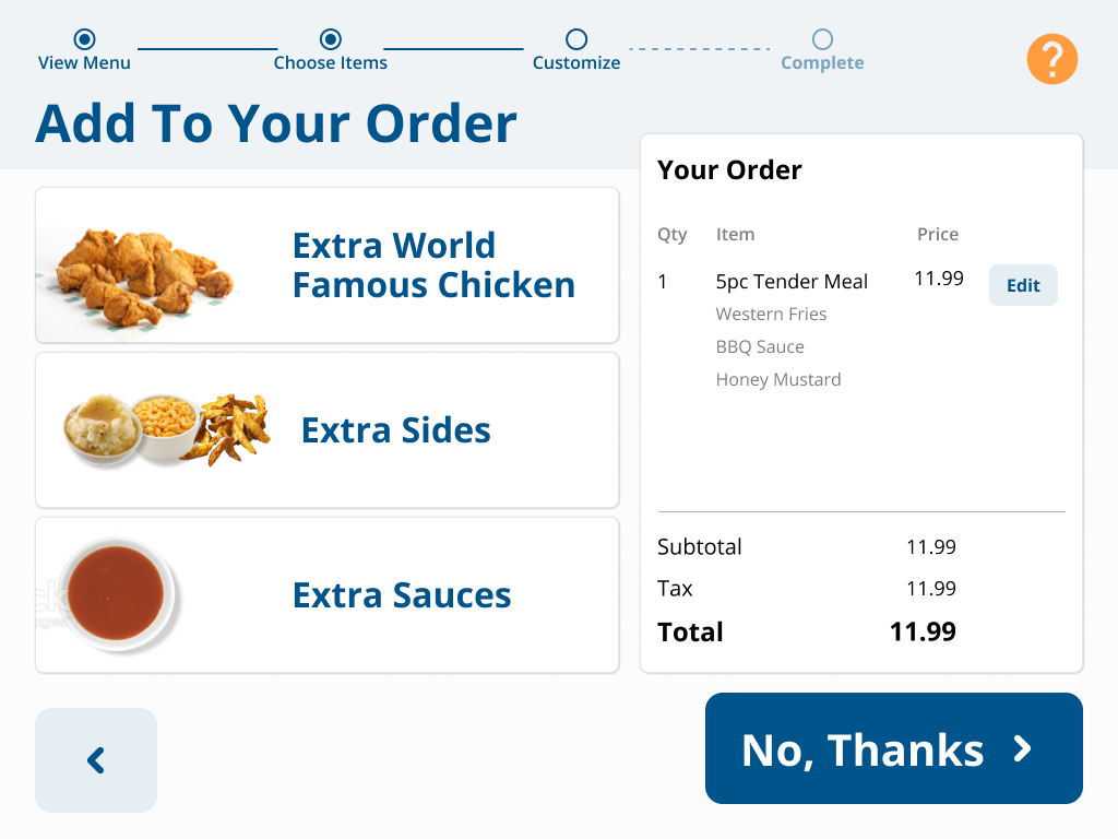
Upsell Screen
We redesigned the upsell screen to make it look more distinct from our other designs. This is so that it will be clear to customers that these items are intended to add on to their original order and are not included.
-
![]()
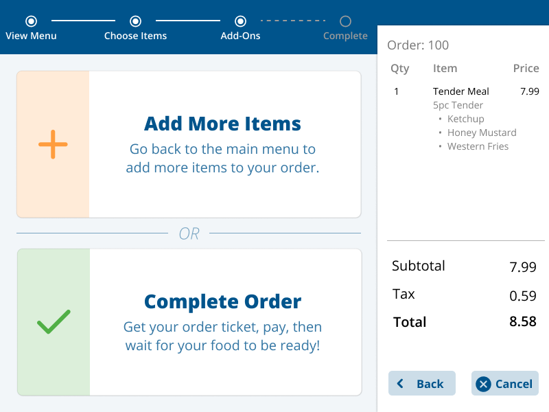
Add Item or Complete Order
This screen allows customers to either add another item to their order or place their order.
-
![]()
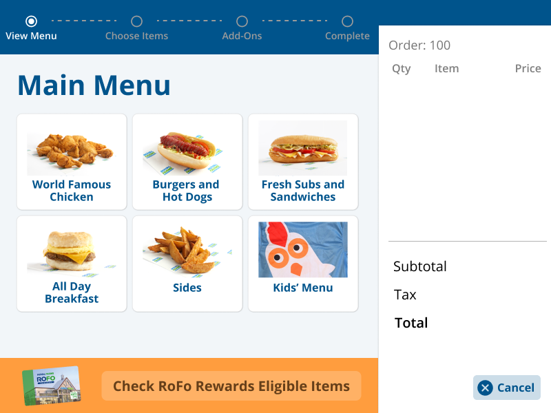
Main Menu
For the menu screens, we recategorized the food items to better match the physical menu that Royal Farms already had. Our goal was to reduce confusion and redundancy and better match customer mental models.
-
![]()
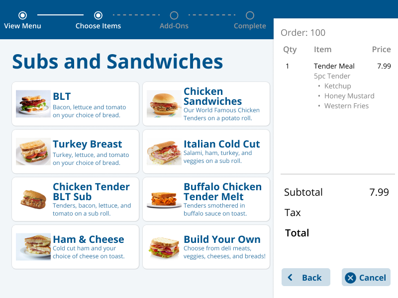
Subs and Sandwiches
For the menu screens, we recategorized the food items to better match the physical menu that Royal Farms already had. Our goal was to reduce confusion and redundancy and better match customer mental models.
-
![]()
Chicken Sandwiches
For the menu screens, we recategorized the food items to better match the physical menu that Royal Farms already had. Our goal was to reduce confusion and redundancy and better match customer mental models.
-
![]()
Choose Bread
We chose to place each customization step on its own screen in order to request information sequentially rather than all at once, as was recommended by the literature. This helps to reduce the cognitive load that is placed on the user.
-
![]()
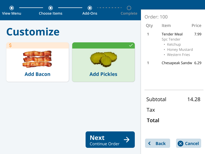
Customize
We chose to place each customization step on its own screen in order to request information sequentially rather than all at once, as was recommended by the literature. This helps to reduce the cognitive load that is placed on the user.
-
![]()
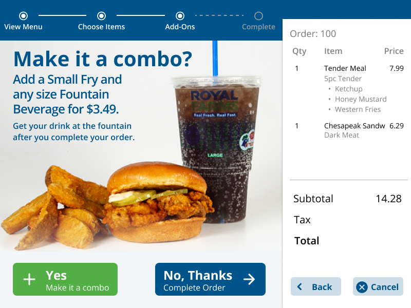
Make it a Combo
This screen allows customers who are ordering certain items to add a side and drink to their meal, which is a new addition to the menu that Royal Farms wanted to include on the kiosk.
-
![]()
Upsell Screen
We redesigned the upsell screen to make it look more distinct from our other designs. This is so that it will be clear to customers that these items are intended to add on to their original order and are not included.
-
![]()
Add Item or Complete Order
This screen allows customers to either add another item to their order or place their order.
-
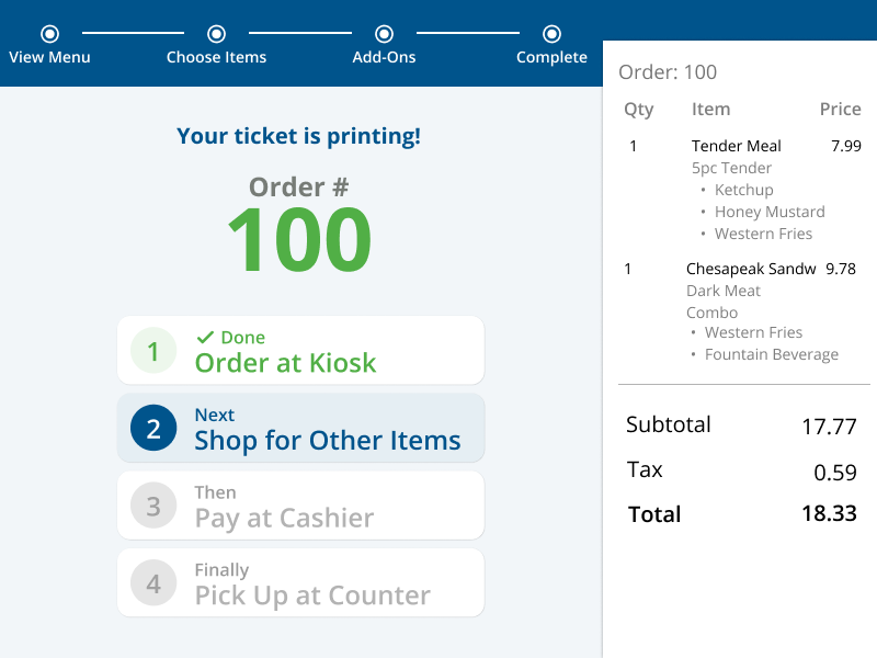
![]()
Complete Order
This is the screen that a customer would see when they complete their order. To eliminate confusion, it outlines the steps that they would need to take before picking up their food at the counter.


prototype demo
designs in action
I was able to visit a Royal Farms location to see how the development team translated our designs into real kiosks. Here is an image of the main menu screen in action:
